Top 10 of 2013: Best Book Covers

This year, Coranne and I are happy to take part in the Top 10 of 2013 meme. There have been a ton of amazing books that have come out this year, or which we've read this year, and so we're spreading our top picks out with a new theme every day.
Today, we're each sharing the best book covers from 2013! Hold on to your seats, these are some pretty awesome covers, Be sure to share your favorites in the comments, too.
Coranne's Picks

By Carey Corp & Lorie Langdon
Published on August 20th 2013
Published by Zondervan
See our review here!
Published by Zondervan
See our review here!
The lush backdrop, the whimsy, and that beautiful dress. I loved it. And you know what else? I loved that it was actually in the book! I can't stand when they slap a pretty girl on a book and she ends up having nothing to do with the story- this one was perfect!

By Amie Kaufman & Meagan Spooner
Published on December 10th 2013
Published by Disney Hyperion
See our review here!
Published by Disney Hyperion
See our review here!
I love the font. I love the stars (Reminds me of the original Across the Universe cover). I love the characters and that they are authentic to the story. I just wish that I would have loved this book....

By Jessica Shirvington
Published on October 1, 2013
Published by Sourcebooks Fire
See our review here!
Published by Sourcebooks Fire
See our review here!
Seriously, this is probably my favorite cover series. They are all just so beautiful. I mean... look at it!

By Shannon Messenger
Published on March 5, 2013
Published by Simon Pulse
Published by Simon Pulse
I actually still haven't read this book, though I really want to. This isn't a cover that I would typically really get into, but I just love how different it is and how it tells a story without being too elaborate.

By Yelena Black
Published on February 12, 2013
Published by Bloomsbury
Published by Bloomsbury
I love this cover. I love that she is a dancer- I love the vivid red of her outfit and the petals against the white and black. They did it in a way that DOESN'T scream Twilight. I love the filigree work on the font- it is just a beautiful cover... however, I didn't like the book so much... sigh.
Sarah's Picks

By Rainbow Rowell
Published on September 10th 2013
Published by St. Martin's Press
Published by St. Martin's Press
While I haven't read this one yet -- it's on the list, because, man, a book about fan fiction and fandom and growing up and all that is right up my alley -- but I an a huge fan of Noelle Stevenson's art. Like, I may have a couple of older prints of her stuff waiting to be framed and put up on my walls. She was really the perfect choice to do a cover for this sort of book. It's super cute and has the added bonus of being pretty much instantly recognizable to anyone who spends much time in the Tumblr fandom world.
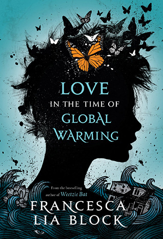
By Francesca Lia Block
Published on August 27th 2013
Published by Henry Holt and Co. (BYR)
See our review here!
Published by Henry Holt and Co. (BYR)
See our review here!
I thought the artwork on this one was fantastic - very evocative of the story and some of the things in it that are symbolic. The butterflies play a big role in the story, as well as the flood and general destruction of everything. There's just so much detail, the longer you look at it. I was excited to see that a) there is a sequel to this book, scheduled for release in 2013, and b) the cover is in the same style as this one, so there's a lot to look forward to.
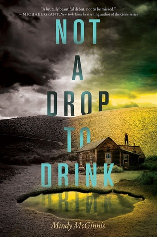
By Mindy McGinnis
Published on September 24th 2013
Published by Katherine Tegen Books
See our review here!
Published by Katherine Tegen Books
See our review here!
My last three picks for best book covers are partially just me geeking out about typography. The coloring, shading, and way the letters drop in and out of the scenery is very eye-catching. The cover to Not a Drop to Drink is sparse and simple. The pond -- the source of so much plot in the story -- is front and center, with a lone person on the roof, defending the pond. If this book cover were a person, it would probably be a person of few words, just like Lynn and Mother in the book. I also love the shift from stark black and white to the pop of bright colors.
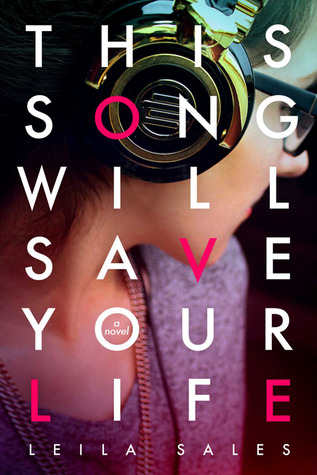
By Leila Sales
Published on September 17th 2013
Published by Farrar, Straus and Giroux (BYR)
See our review here!
Published by Farrar, Straus and Giroux (BYR)
See our review here!
While I had a handful of problems with this book, I was totally in love with the cover. The font, spacing, choice of color on the letters L-O-V-E (which I honestly didn't even notice for a long time), the focus on the headphones with the rest of the girl's face kind of out of focus... it's just really well put together and color coordinated. I would definitely have picked this one up just based on the cover alone, even before reading the blurb.

By April Genevieve Tucholke
Published on August 15th 2013
Published by Dial
Published by Dial
My last pick is another one I haven't read, although it is on my to-be-read list, but man, I just love the curling, gothic font and how it just dominates the cover. The artwork itself is very eerie and foreboding, and makes you ask a lot of questions. Who are the people standing at the top of that cliff? What's going on? Is it something terrible? I hope the book can answer these questions, because I really want to know!


